In today’s world, QR codes are key for sharing info, interacting with products, and accessing online content easily. But not all QR codes work the same. To make sure yours are scannable and effective, follow some important design and use tips.
This article will show you how to make scannable and effective QR codes. We’ll cover the basics and the best design practices. You’ll learn how to make QR codes that really stand out.
Key Takeaways
- Understand the different types of QR codes and their applications
- Learn best practices for designing scannable QR codes
- Discover guidelines for optimal QR code sizing and readability
- Explore strategies for enhancing contrast and color schemes
- Recognize the importance of error correction levels and their impact on scanning
Understanding QR Code Fundamentals and Their Importance
QR (Quick Response) codes are everywhere in our digital world. They make it easy to share and access information. Smartphones and other devices can scan them quickly, connecting the physical and digital worlds.
Knowing how QR codes work and their uses can help businesses and people. It makes it easier to engage with users and share data.
Types of QR Codes and Their Applications
QR codes come in different types, each for a special use. Static QR codes link to a fixed URL, while dynamic ones can change. This makes QR codes very useful.
They can send customers to websites, share contact info, or even handle mobile payments. QR codes are getting more versatile, making things easier and more innovative.
Evolution of QR Code Technology
QR codes have changed a lot since the 1990s. They can now be scanned by smartphones easily, thanks to better technology. This has made QR codes more reliable and readable.
As QR code tech keeps improving, we’ll see even more cool uses. We’ll also see better QR code contrast for easier scanning.
Benefits of Well-Designed QR Codes
Good QR code design offers many benefits. It can make customer interactions better, make information easy to find, and speed up processes. This includes marketing and customer support.
By focusing on design and function, businesses can use QR codes to boost sales and gather data. It also makes the user experience more memorable.
“QR codes have transformed the way we interact with the digital world, blurring the lines between physical and virtual spaces. By understanding their fundamentals and embracing best practices, businesses can harness the power of this technology to drive innovation and enhance customer experiences.”
Essential Elements of Designing Scannable QR Codes
Making a QR code that looks good and scans well needs focus on key design rules. A good QR code has several important parts that work together. This makes sure users have a smooth experience.
The size of each square dot, or module, is very important. These modules must be big enough for scanners to see but not so big they lose data. Finding the right size is key to making the QR code work well.
The quiet zone around the QR code is also crucial. This empty space helps scanners read the code right. Keeping enough quiet zone is a main QR code design principle for easy scanning.
Data density, or how much info the QR code holds, is another big factor. More data means more content but can make the code harder to scan. Improving QR code user experience means finding a balance between data and readability.
By thinking about these key design parts, QR code makers can make codes that are easy to scan and use. This improves the customer experience and boosts engagement.
| Design Element | Description | Importance for Scannability |
|---|---|---|
| Module Size | The individual square dots that make up the QR code | Modules must be large enough to be easily detected by scanning devices |
| Quiet Zone | The empty space that surrounds the QR code | Provides a buffer for the scanner to accurately read the code |
| Data Density | The amount of information encoded within the QR code | Higher density can make the code more complex and harder to scan |
By knowing and using these QR code design principles, businesses and designers can make QR codes that are easy to scan and use. This improves the customer experience and boosts engagement.
QR Code Sizing Guidelines for Maximum Readability
It’s important to make sure your QR codes are the right size. This helps them scan better and makes them easier to use. By following the best practices, you can make sure your QR codes work well for everyone.
Minimum Size Requirements
QR codes need to be a certain size to scan well. They should be at least 2 inches (5 cm) on the smallest side. This size is big enough for most phones to scan from a few feet away.
Scaling Considerations for Different Scanning Distances
The size of your QR code depends on how far you want people to scan it. For things like business cards, a smaller QR code works fine. But for big signs or billboards, you’ll need a bigger QR code.
Size-to-Content Ratio Best Practices
Think about how much information you’re putting in the QR code. The code should take up about 10-20% of the space it’s in. This makes sure it’s big enough to scan but doesn’t take over the design.
| Scanning Distance | Recommended QR Code Size |
|---|---|
| Close-range (product packaging, business cards) | 2-3 inches (5-7.5 cm) |
| Medium-range (posters, signage) | 3-4 inches (7.5-10 cm) |
| Long-range (billboards, large displays) | 4-6 inches (10-15 cm) |
Following these QR code sizing guidelines will help your audience scan them easily. This makes your QR codes more effective and helps you get the most out of this technology.
Optimizing Contrast and Color Schemes
Creating visually appealing QR codes requires careful thought on contrast and color schemes. The way the QR code pattern interacts with its background is key. It helps make the QR code easier to read and scan.
Choosing the right colors is crucial for QR code contrast. It’s important to find a balance between the QR code and its background. Colors like black on white or white on black work best for scanning.
Low-contrast colors can make the QR code hard to see and scan. Also, colors like red and green can be tricky for people with color vision issues.
| Color Combination | Scanning Performance |
|---|---|
| Black on White | Excellent |
| White on Black | Excellent |
| Blue on Yellow | Good |
| Red on Green | Poor |
Think about where your QR code will be used when picking colors. Lighting, surface materials, and obstructions can affect QR code contrast and QR code readability.
By choosing colors wisely and optimizing contrast, you can make QR codes that are both good-looking and functional. They will engage your audience and make scanning easy.
Error Correction Levels and Their Impact on Scanning
Creating effective QR codes means knowing about error correction. QR codes can handle damage or distortion, making them reliable for scanning. The right error correction level is key to making QR codes scan well.
Understanding Error Correction Capabilities
QR codes have a built-in error correction feature. This feature lets them be scanned even when they’re damaged. There are four levels of error correction: Low, Medium, Quartile, and High. Each level adds more data redundancy, but higher levels mean less data can be stored.
Choosing the Right Error Correction Level
- Low error correction: Good for places with little interference, where the QR code won’t get damaged.
- Medium error correction: Best for areas with some challenges, balancing data and error tolerance.
- Quartile error correction: Ideal for risky spots where the QR code might get badly damaged.
- High error correction: Most durable, for tough conditions like harsh outdoors or crowded places.
Balancing Quality and Data Capacity
Choosing an error correction level depends on the QR code’s use and where it will be scanned. Higher levels make the code more resilient but reduce data capacity. Finding the right balance is key for QR codes that scan well and hold lots of information.
| Error Correction Level | Data Capacity Reduction | Recommended Use Cases |
|---|---|---|
| Low | 7% | Minimal interference, controlled environments |
| Medium | 15% | Moderately challenging environments |
| Quartile | 25% | High-risk environments, potential for damage |
| High | 30% | Harsh outdoor conditions, heavily populated areas |
Knowing how error correction levels affect QR codes helps you make them better. By picking the right level, you ensure your QR codes are both good-looking and reliable for scanning. This improves the user experience and the success of your QR code campaigns.
Strategic QR Code Placement for Enhanced Accessibility
Putting QR codes in the right places is key to making them more visible and easy to use. By placing them wisely, you can make scanning more successful. Let’s look at some important tips for placing QR codes in different settings.
In print materials like brochures or product packaging, QR codes should grab attention. Place them near important information or calls-to-action. Make sure they’re big enough to scan easily and stand out against the design.
For digital spaces, like websites or social media, QR codes should blend in smoothly. Put them near useful info or actions, making them part of the design. This way, they enhance the look and feel of the content.
In real-world settings, like stores or events, place QR codes where they’re easy to find. Put them near items or info people might want to check out. This makes scanning simple and convenient.
No matter where you use QR codes, keep them clear of obstructions. Make sure they contrast well with their background and can be scanned from a distance. By following these QR code placement strategies, you can improve the QR code user experience and boost engagement with your digital content.
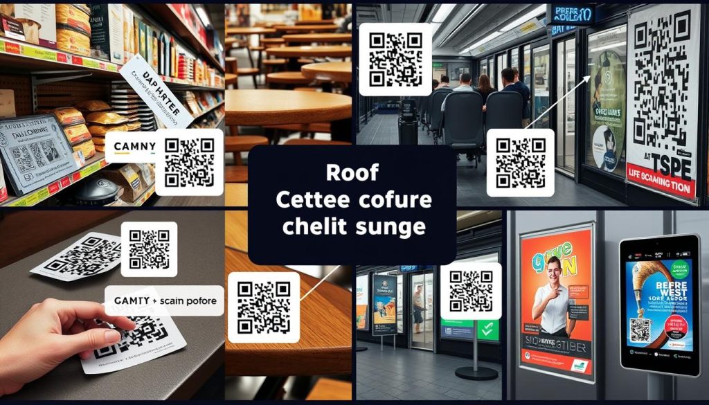
“Effective QR code placement is the key to unlocking their full potential and driving meaningful customer engagement.”
Testing and Validation Methods for QR Codes
It’s key to make sure your QR codes work well for scanning. A good testing and validation process is vital. We’ll look at how to check your QR codes on various devices and in different places.
Cross-Device Testing Protocols
Testing QR codes means checking how they work on many devices. This includes phones, tablets, and scanners. Make sure to test them on both iOS and Android, and on different screens and cameras. This helps find any problems and makes sure they scan well everywhere.
Environmental Testing Considerations
QR codes face different conditions like light, distance, and surface. Test them in many places and on different materials. This ensures they work well indoors and outdoors, and on various surfaces like paper and glass.
Performance Monitoring Tools
- Use tools to track how your QR codes are doing. These tools show scan rates, user activity, and more. This helps you improve your QR codes based on data.
- Check the feedback from these tools often. It helps you spot problems and make your QR codes better. This keeps them useful and interesting for your audience.
By following these steps, you can be sure your QR codes are ready for scanning. This gives your customers or audience a smooth and efficient experience.
Common Design Mistakes to Avoid
Creating an effective QR code is key to a good user experience and successful scans. But, there are common mistakes that can mess up your QR code. Knowing these mistakes helps you make QR codes that are easy to scan and use.
One big error is using low-quality or pixelated images. This makes the QR code hard to scan, frustrating users. Also, complicated or cluttered designs can block the scanning process. The QR code should be simple and clear for easy recognition.
Another mistake is not optimizing the QR code user experience. Make sure the content or page the QR code links to works well on mobile. If it doesn’t, it can ruin the QR code’s purpose.
Many designers forget about where to place the QR code. It should be in a spot that’s easy to see and scan. If it’s hidden or hard to find, people won’t use it as much.
To steer clear of these mistakes, follow the best practices for QR code design and placement. By focusing on QR code design principles and improving QR code user experience, you can make QR codes that look good and work well. This boosts your QR code marketing campaigns.

Conclusion
In today’s marketing world, making scannable QR codes is key. Knowing how to design them well helps businesses and people connect better with their audience. This leads to more effective results.
We’ve looked at what makes a QR code scan well. This includes knowing the different types and how they’ve changed. Also, we talked about making them the right size, contrast, and error correction levels. Following these tips helps your QR codes work smoothly, making interactions better.
When you start using QR codes, focus on making them scannable and easy to read. These are crucial for creating codes that grab attention and connect with your audience. By getting good at designing QR codes, you can use this technology to boost engagement, increase sales, and meet your marketing goals.


